A digital showroom for institutional decisions
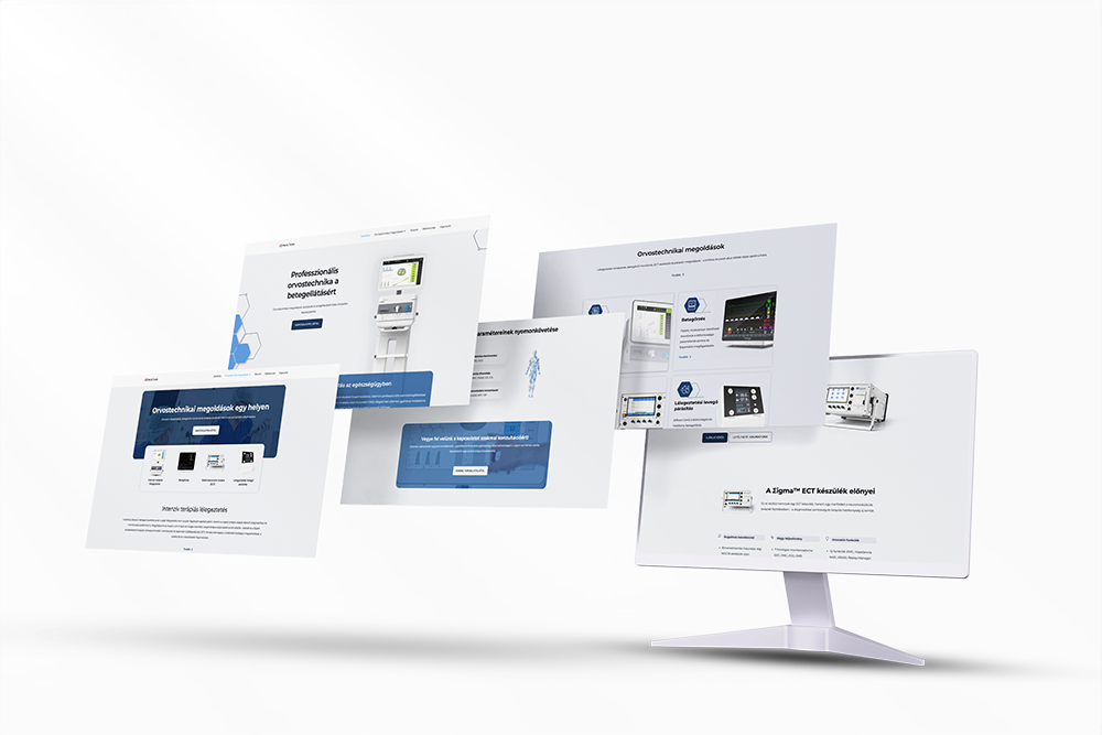
The Med & Trade website is for hospital decision-makers who choose medical technology through long processes involving many stakeholders. I organised the content around clinical problems instead of product lists, so the site doesn't try to sell — it helps people decide.
Context
Med & Trade is a medical technology company with decades of history, offering solutions in intensive care, monitoring and neuromodulation. The website isn't a classic marketing site but a digital showroom: it's where institutional decision-makers gather information, evaluate options and prepare decision documents.
The goal was a structured, trust-building system that fits the B2B / B2G decision-making environment.
The problem
Choosing medical equipment at an institution is a complex decision:
- many stakeholders are involved (physician, technical lead, procurement)
- different criteria compete (clinical, financial, regulatory)
- the risk and the responsibility are high
The existing site structure didn't follow this logic:
- the content was product-centred
- the connections between solutions weren't clear
- the site didn't actively help institutions find their way
How do you structure complex professional content in a way that's clear and responsible?
UX goal
I wanted a digital showroom that supports the institutional, multi-stakeholder decision process — helping with structured information rather than marketing messages.
The focus was on strengthening professional credibility, reducing decision uncertainty and presenting complex solutions clearly.
The goal wasn't fast conversion, but safe decision-making.
Solution-based information architecture
I reorganised the structure around clinical and usage problems instead of product categories. The main entry points:
- intensive care ventilation
- patient monitoring
- electroconvulsive therapy
- humidification of breathing air
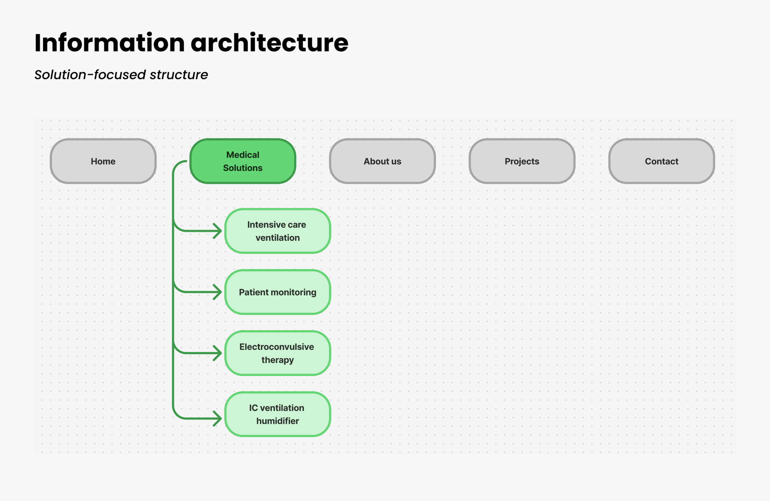
This is closer to how institutions think: users reach the right solution through their own problem.
Decision situations
In an institution, the user isn't a shopper but a decision-maker who has to take responsibility for the choice. I started from these situations:
- what clinical problem they need to solve
- what environment and capacity the institution works with
- what documentation and background information the decision requires
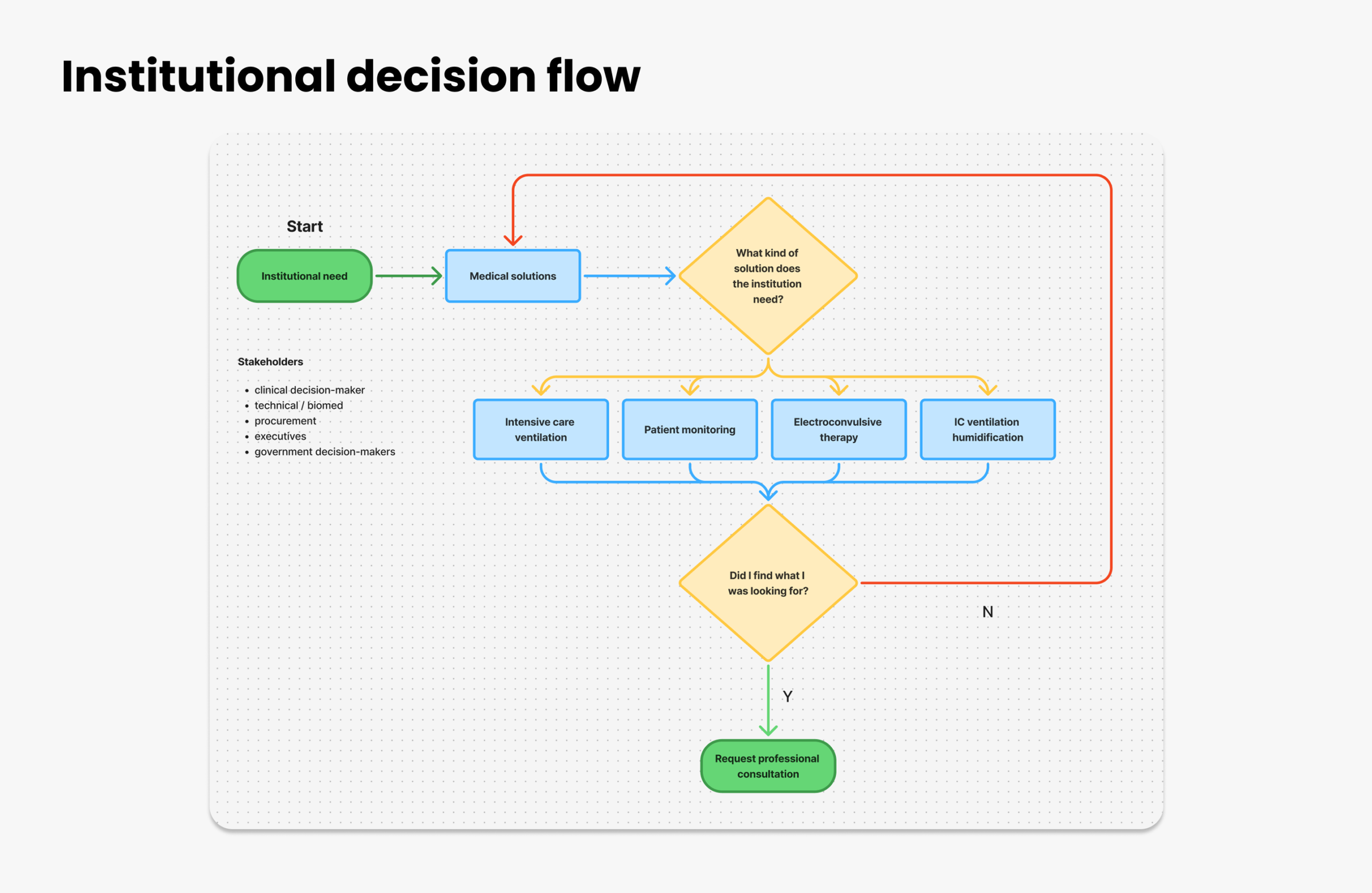
The goal wasn't instant conversion, but less uncertainty in the decision.
Solution landing page
How the solution pages are built:
- clinical problem → solution
- features framed by clinical benefits
- restrained, professional CTAs
- documentation and further information within reach
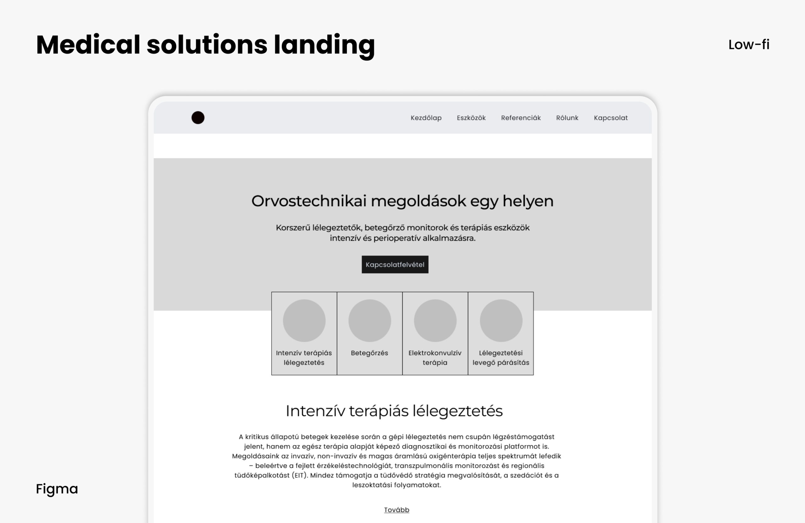
At this stage the visuals stayed deliberately restrained, so the structural decisions could lead.
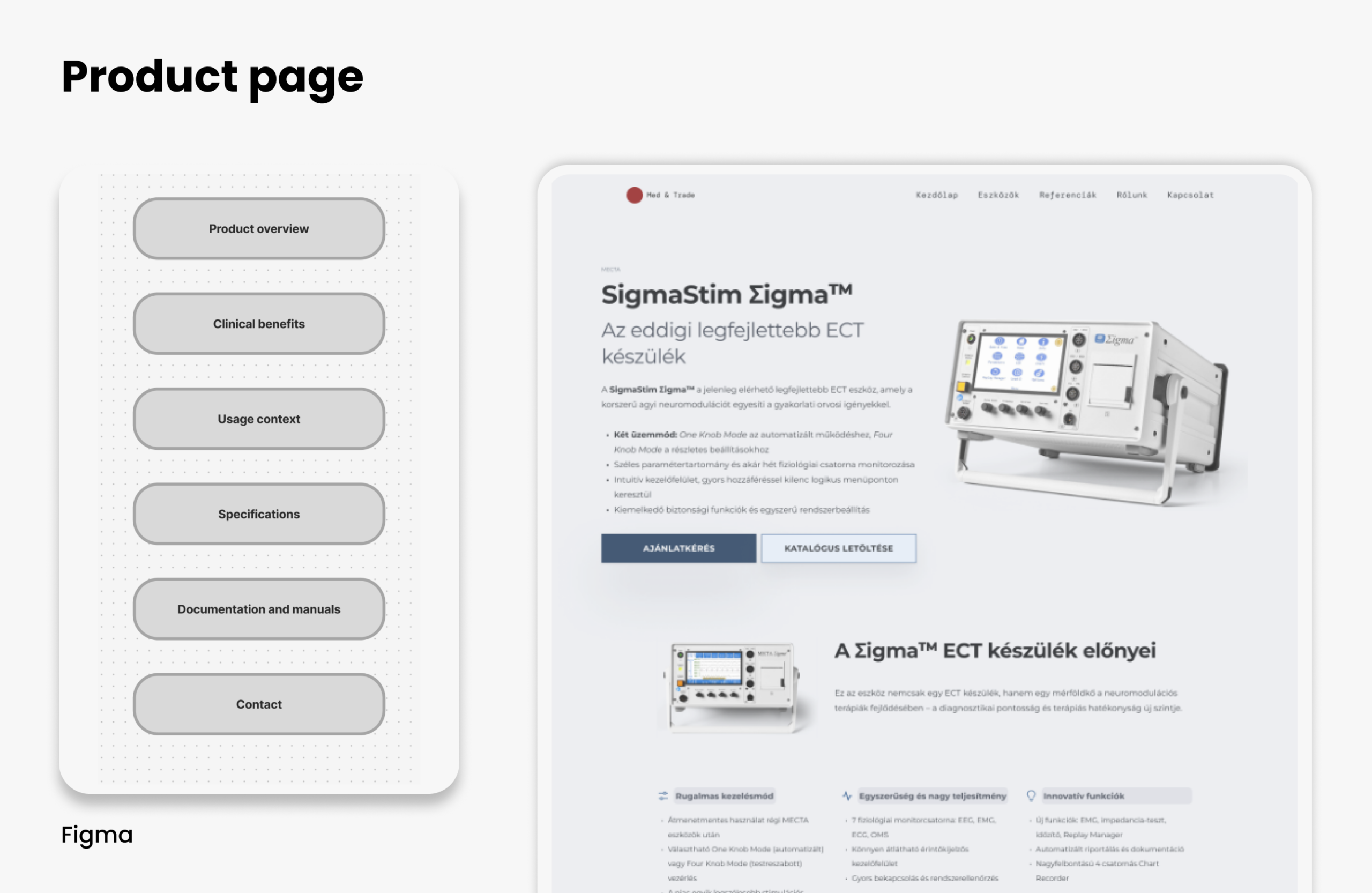
Product pages
The product pages aren't there to sell, but to provide professional validation. The content hierarchy:
- who it's for
- clinical and practical benefits
- context of use
- structured specifications
- downloadable documentation
The solution
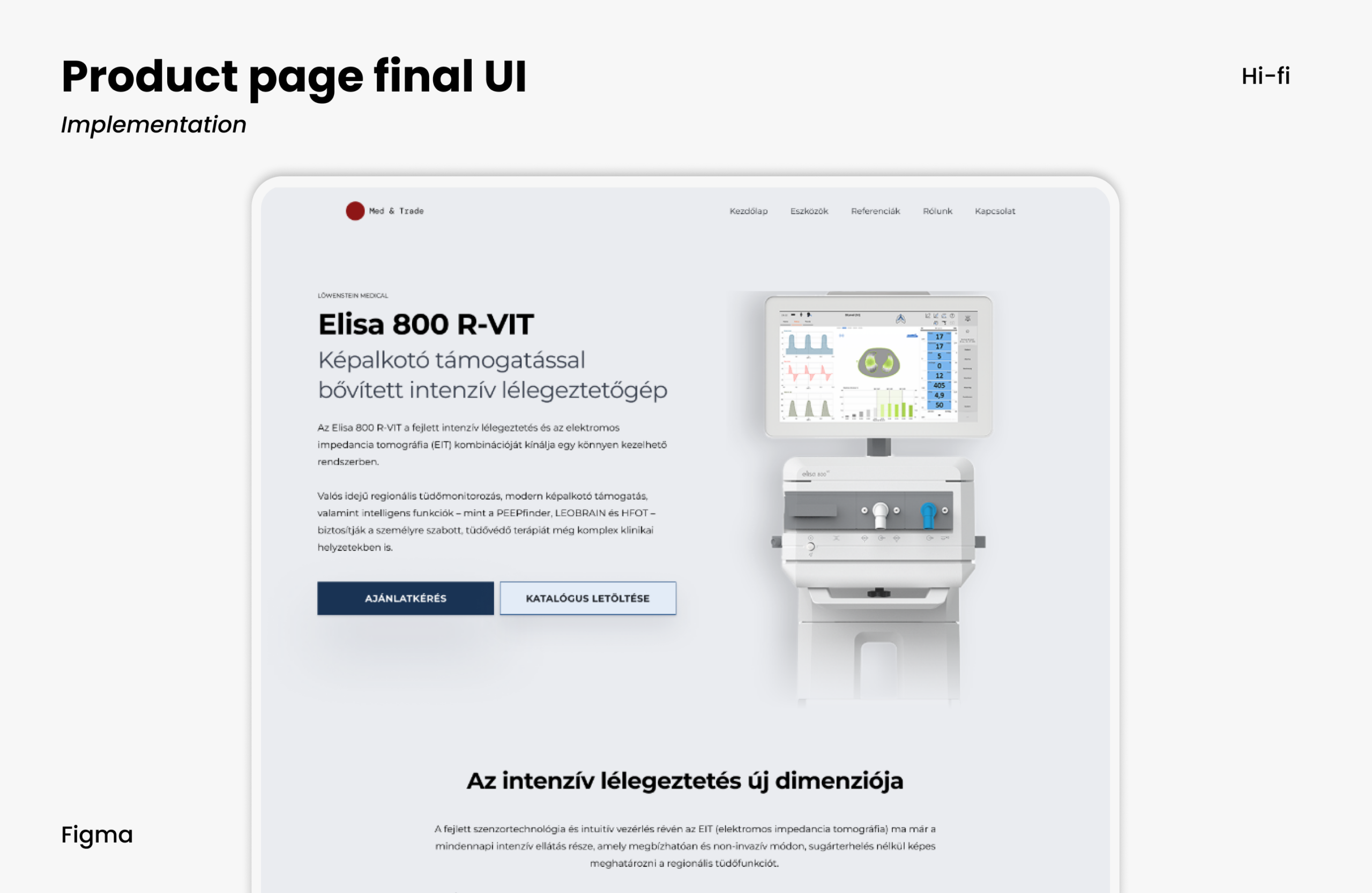
The final interface is a restrained, structured and professionally credible digital showroom. The solution-based structure, transparent content and support for the decision process build trust and help with complex institutional decisions.
The site supports decisions with structured knowledge instead of messages.