A guesthouse where deciding feels calm
Gabilak is a small guesthouse in Gyula, Hungary, where booking is an emotional decision. I designed the decision path of the website based on real guest reviews: from the first impression, through reassuring information, to a simple, question-free booking.
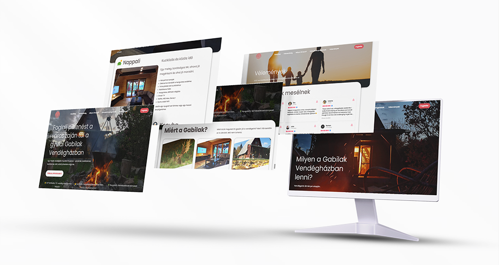
Context
Gabilak Guesthouse is a small-scale accommodation in a quiet residential part of Gyula. It mainly welcomes couples, families and small groups of friends who want to genuinely rest, not mass tourism.
Before the project, bookings ran through an external platform (Airbnb), so most of the guest communication and the decision process was out of the owners' hands. The goal was a standalone website that conveys the atmosphere of the place before booking and reduces uncertainty.
The problem
Interest was high, but the decision process:
- stayed heavily platform-dependent
- wasn't consciously guided
- many questions only came up after booking
The guest reviews made it clear that the real value of the place is the experience and the calm — but the online presence didn't convey this consistently.
How do you make an emotional decision feel safe and confident?
UX goals
- emotional reassurance from the very first screen
- less uncertainty during the decision
- realistic expectations, no overpromising
- a simple, question-free booking path
- deliberately building guest reviews into the experience
The focus throughout was on letting guests make a calm decision.
Insight-based design
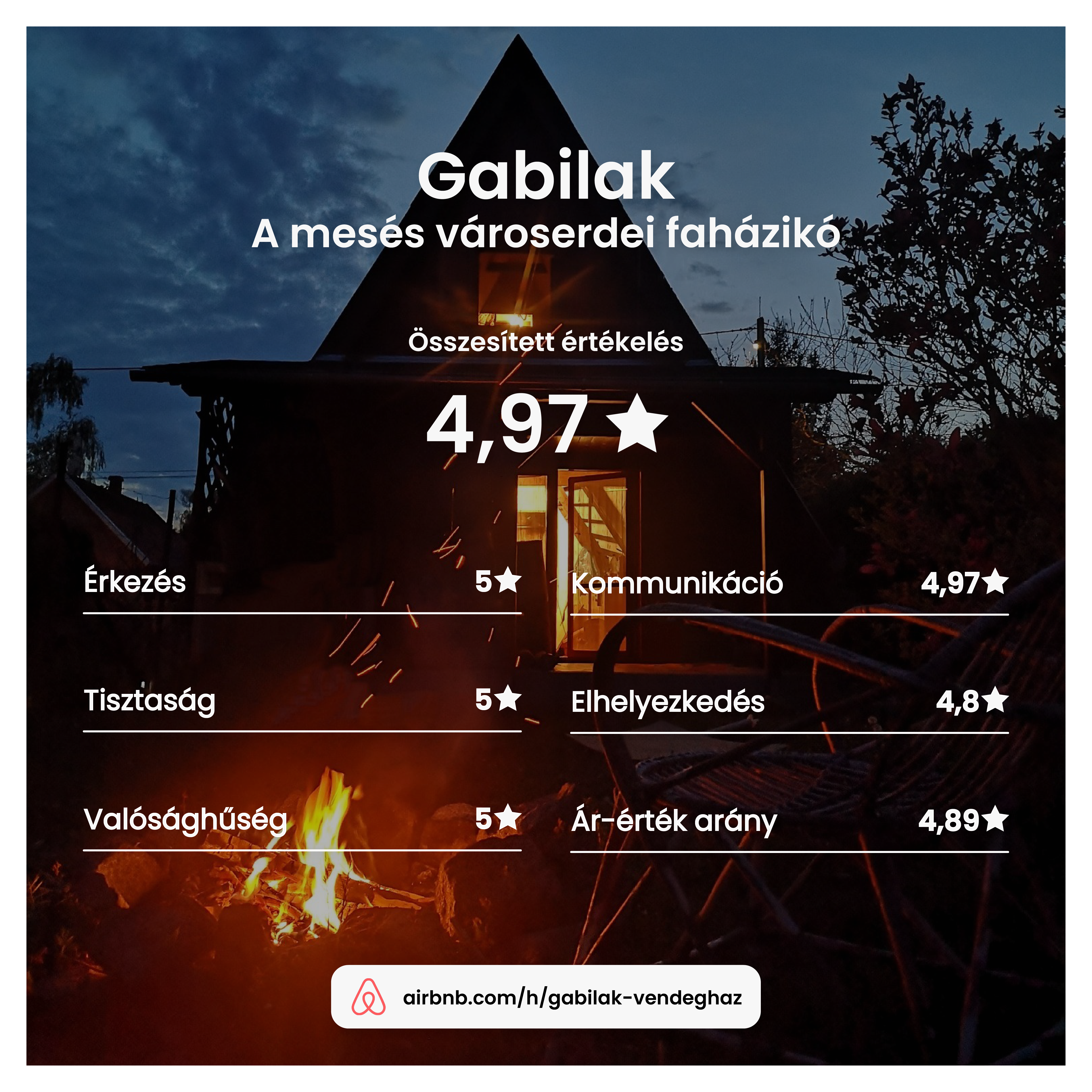
The design was based on analysing dozens of guest reviews. The recurring feelings:
- “quiet, peaceful surroundings”
- “exactly like in the photos”
- cosiness, feeling at home
- the garden, barbecues, time spent together
- friendly, quick communication
Information architecture and decision path
The site follows the guest's mental journey:
- Emotional connection – “Is this for me?”
- Visualised experience – “What's it like to be there?”
- Building trust – “Did others enjoy it too?”
- Rationalising – “What exactly do I get?”
- Decision – “I'll book.”
The pages are built around decision stages, not features.
From structure to interface
In the wireframes I focused on:
- visual rhythm and white space
- easily scannable content
- photos as the primary carriers of information
- few but clear CTAs
The goal wasn't to push, but to create a sense of arrival.
Booking as a UX moment
The booking process was kept deliberately simple:
- picking dates
- a short form
- clear confirmation
The emphasis was on a sense of safety, not automation. Guests should feel they're booking with a person, not a system.
The solution
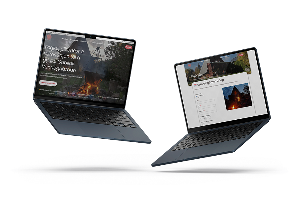
The finished website:
- filters out guests who aren't a good fit on the very first visit
- reduces uncertainty before booking
- authentically conveys the real experience of the place
- works as an independent brand in the long run
The site doesn't promise more than the guesthouse delivers — and that's exactly what makes it credible.